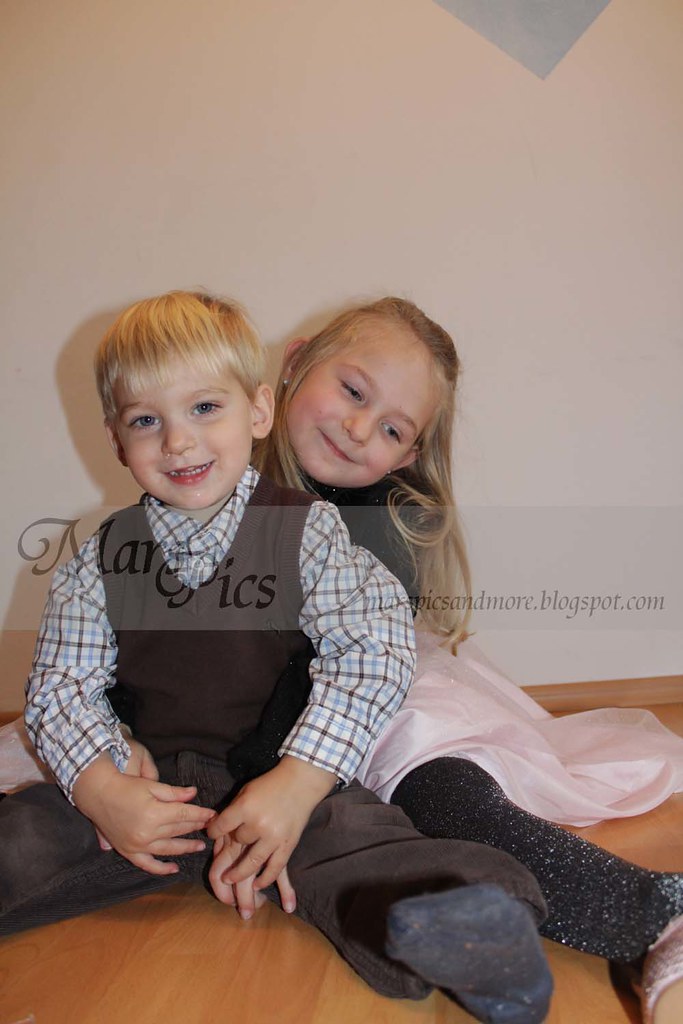
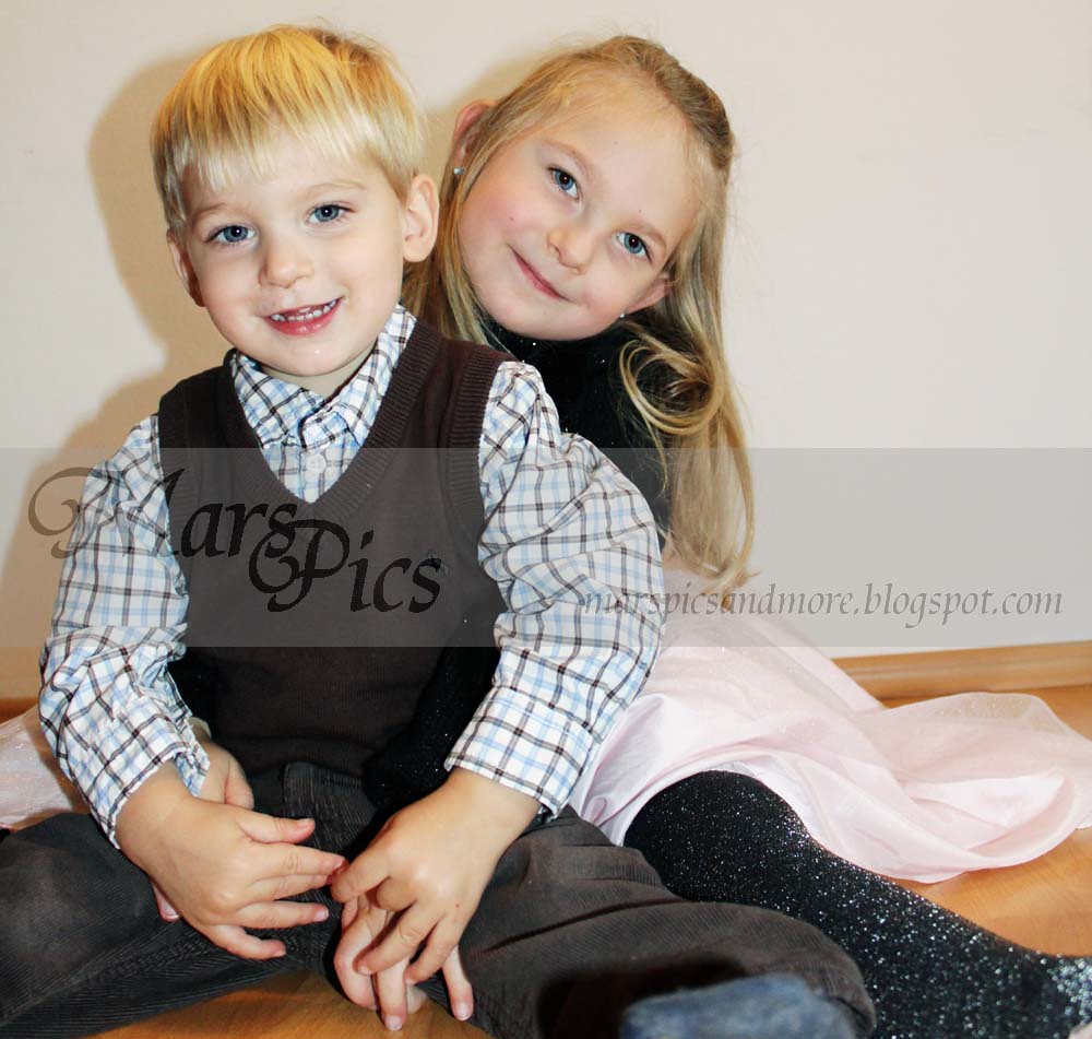
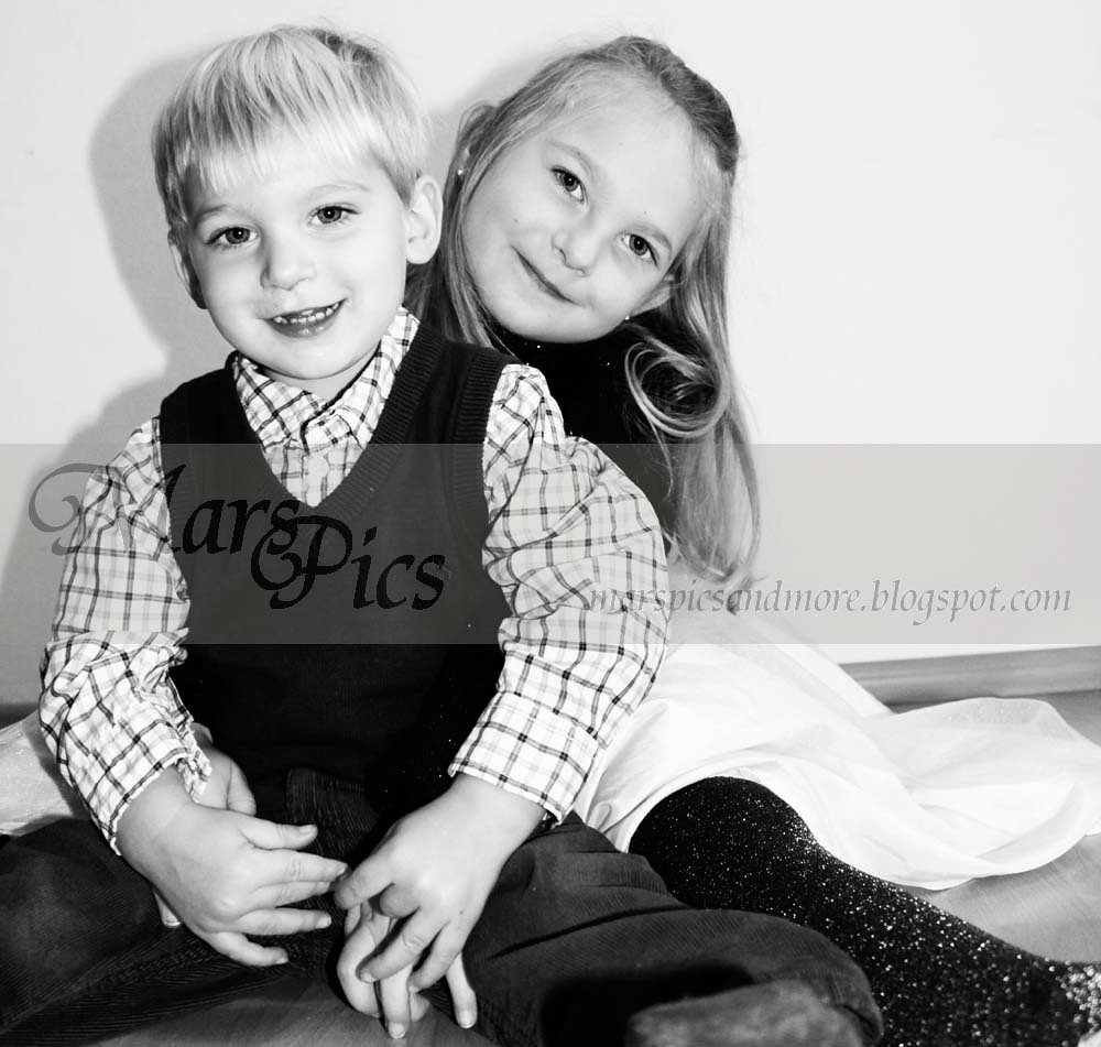
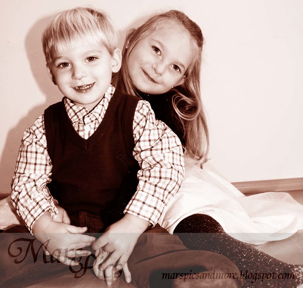
 So I desided to add this add this photo to the Paper HeartCamara touch up Tuesday. I am adding 3 edits, the color, b&w and sepia. I think I like The Sepia best.
First I opened the photo in Photoshop and cropped the photo. Afterwards I opened my second picture to to change the eyes, since Ms Mar is looking down and I couldn’t get a photo of both kids looking into the camera. I cut out the eyes, copied them into the Main photo, and adjusted the size and angle to get it to fit onto the main photo. Then I flattened it.
After that I adjusted the Levels, curves, Color Balance, Brightness/Contrast, duplicated the layer and added a soft light layer. I also ran the Coffee Shop Baby Powder Room action then put them all into a set and lowered the occupancy on the whole set. What I was happy with the way it looked I flattened it.
After that I added a b&w gradient map, changed the curves to adjust the b&w how I liked it. Then to get the Sepia tone I played around with the color balance over the b&w.
What one do you like best. For more Touch up Tuesday photos head on over to Paper Heart Camera


